Design,
Soccer
and Beer
chumilo.co


Concept
English
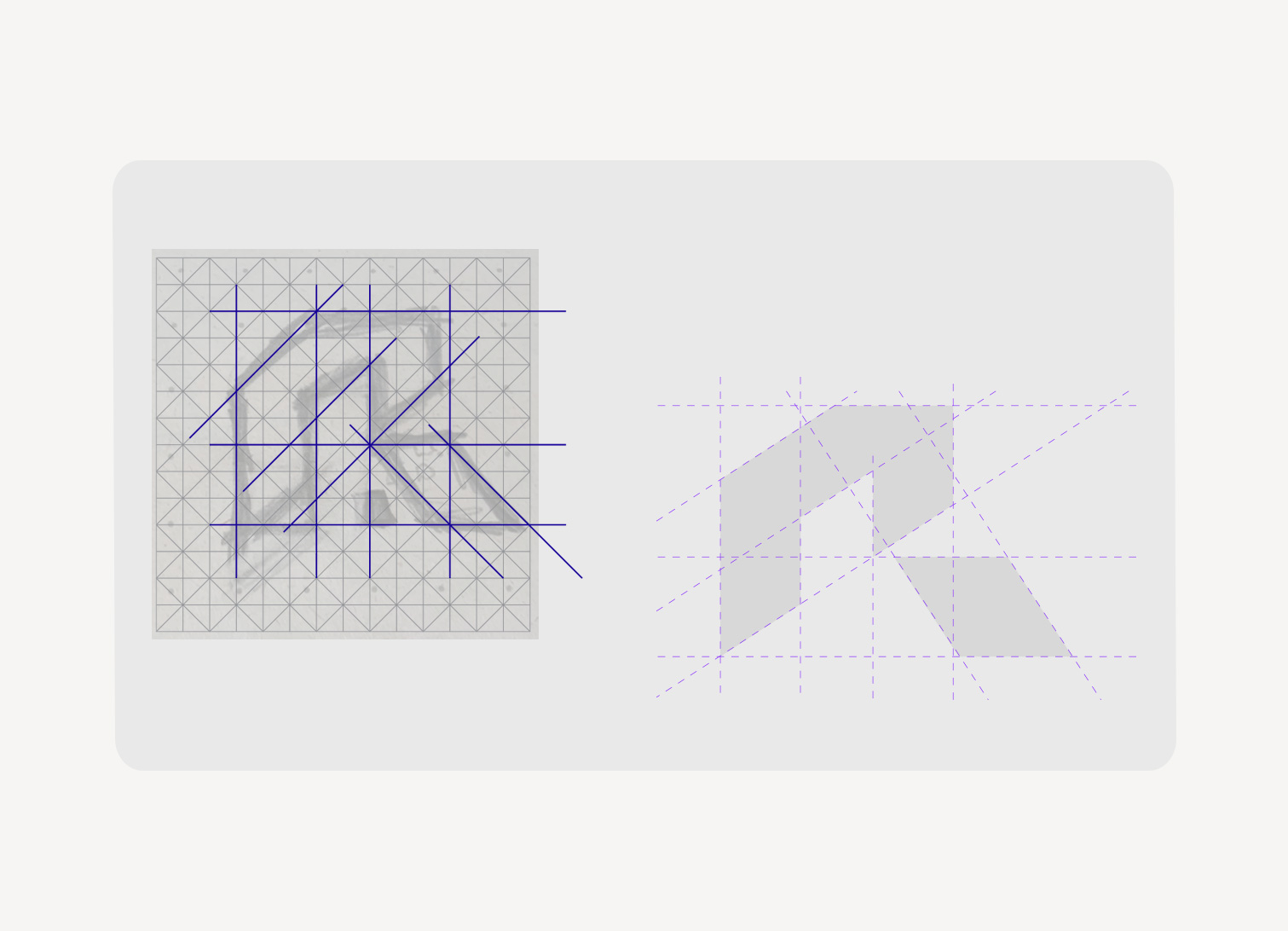
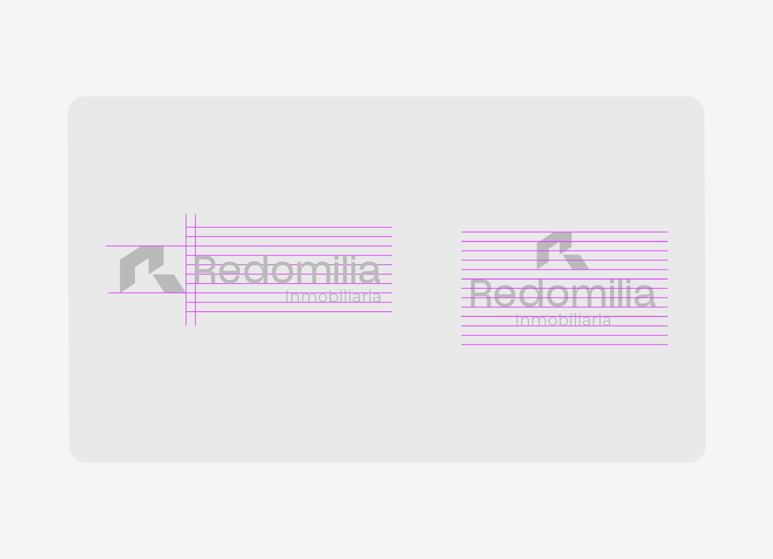
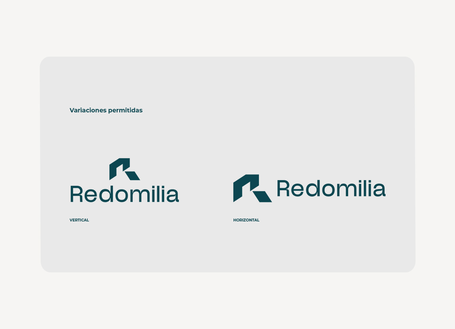
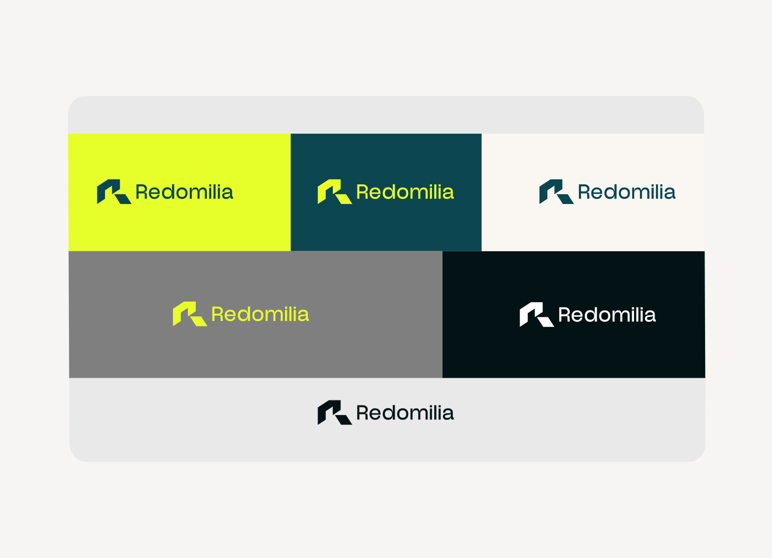
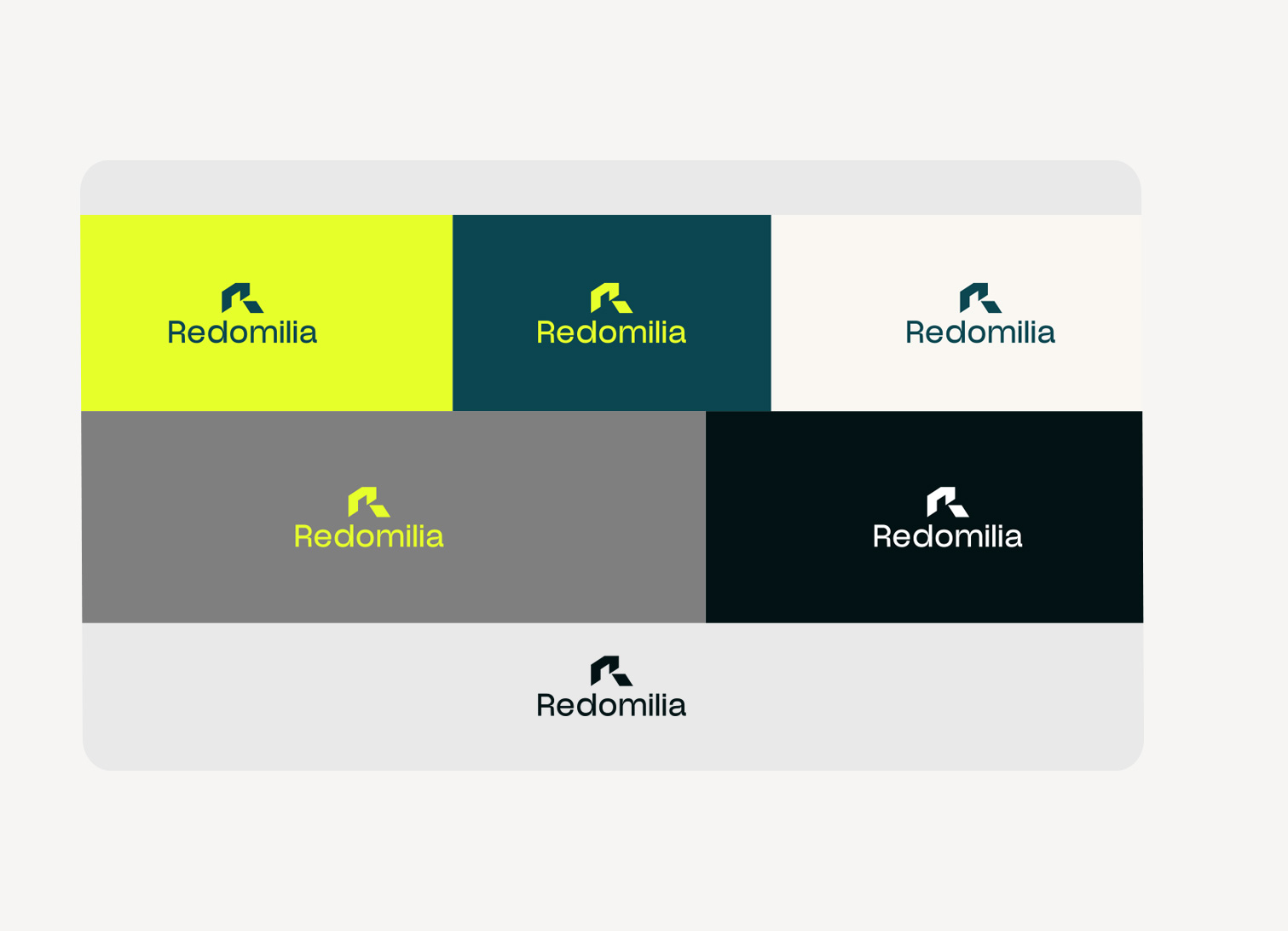
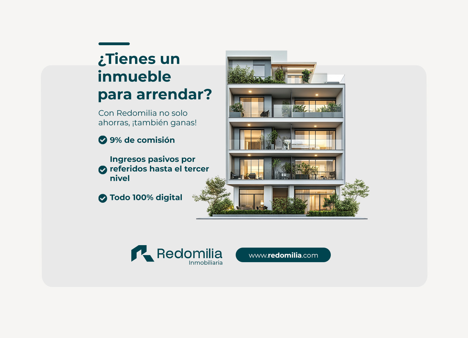
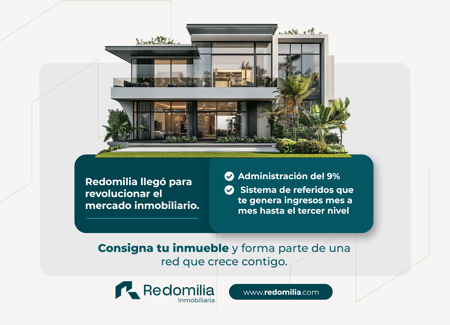
The Redomilia brand mark represents its identity as a rental network based on networking, highlighting stability, home, and connection. It is composed of a graphic symbol and a typographic logotype: Graphic Symbol (Isotype): A squared “R” that conveys solidity and structure. Its upper extension forms a roof, symbolizing the real estate sector and the idea of home. In addition, its geometric design reflects professionalism and trust. Logotype (Newblack Typeface): A modern and legible typeface that complements the isotype, reinforcing the brand’s identity. The brand mark allows flexibility in its application, always maintaining a strong and recognizable visual identity.
Español
El imagotipo de Redomilia representa su identidad como una red de arrendamientos basada en networking, destacando estabilidad, hogar y conexión.
Se compone de un símbolo gráfico y un logotipo tipográfico:
Símbolo gráfico (Isotipo): Una "R" cuadrada, que transmite solidez y estructura. Su extensión superior forma un techo, simbolizando el sector inmobiliario y la idea de hogar. Además, su diseño geométrico refleja profesionalismo y confianza.
Logotipo (Newblack Typeface): Una fuente moderna y legible que complementa el isotipo, reforzando la identidad de la marca.
El imagotipo permite flexibilidad en su aplicación, manteniendo siempre una identidad visual fuerte y reconocible.